Rosanne
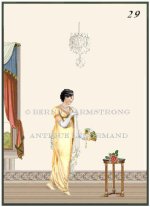
Love it Bee. I wonder if you could make the figure/window/table dimensions just a tad taller as there is a lot of blank card there.
As my Grandfather would have said..."Aye Lass you doing a grand tackle of it"
Perfect lady for a the Lady.
~Rosanne
As my Grandfather would have said..."Aye Lass you doing a grand tackle of it"
Perfect lady for a the Lady.
~Rosanne