Discussion Thread for: The Making of a New AT Collab Deck

seven stars

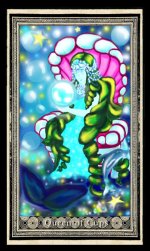
Yup 8 does indeed cover a little of the artwork, so maybe that one will be voted *out*....here is option 1 some people might not have seen. For me personally, when I see a deck with either black or white borders, it just instantly turns me off. Ruins everything.

I'm also attaching idea number 9, which, if you look closely, has tiny little "A T"s all around it. I kind of like this one a lot.

If that one was too much it can be edited like Border idea # 10.
 

Attachments

  • Border 10 Queen of Cups.jpg
    Border 10 Queen of Cups.jpg
    77.1 KB · Views: 92

Marirowana

I like the idea of #9, but it's too much for the border indeed, they should be pretty but not attract too much attention, it will be a busy deck anyway ;)

... But, maybe it's nice to do something with the letters AT, or even 'Aeclectic Tarot' on the card backs :)

I like a black and white border.
 

daphne

I like nr 1. Nr. 9 I find it too busy.
 

Flames

Hi Seven Stars,

I do like #1.

I think a "simple" frame would work really well, one that would help to accentuate and bring out the art image without compromising its uniqueness and charm by having a "busy" border (which IS beautiful, btw, you should know :)). Personally, though, if the border is too busy, it may take away from the card, almost as if they'd be competing with one another for the spotlight, especially when you consider how eclectic this deck will be and already is. :)

A simple border, I feel, would work better at unifying a diverse looking deck. What "simple" translates into, is another thing...

I'm curious to know why you're turned off by a black or white border...Not that I'm yay or nay for either, just curious...

I think as time goes on, and more cards are completed, I'll get a better sense of the kind of border I'd like to see.
 

reall

oh no problem i do this every day - people write back a dozen times with card back ideas & graphics & edits & changes etc., so, yah, just when you have it settled in your heads what you'd like & do whatever vote you have going, just let me know & I'll make it so! =) If I don't answer in here just PM me, sometimes AT mail gets sent to spam unfortunately.

Yup 8 does indeed cover a little of the artwork, so maybe that one will be voted *out*....here is option 1 some people might not have seen. For me personally, when I see a deck with either black or white borders, it just instantly turns me off. Ruins everything.

I'm also attaching idea number 9, which, if you look closely, has tiny little "A T"s all around it. I kind of like this one a lot.

you have my admiration and gratitude for this!^^ like 1 and 8 and 9 is WoW!^^;))))
 

seven stars

I'm curious to know why you're turned off by a black or white border...Not that I'm yay or nay for either, just curious...

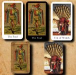
I just think it makes the deck look cheap & amateur. But that's just my opinion. There are sure millions sold that way.
 

Attachments

  • Black and white vs anything else.jpg
    Black and white vs anything else.jpg
    115.8 KB · Views: 85

Laura Borealis

I actually like #9 - very attractive and I love the idea of using the initials AT. But I can see the point about it being busy.

Simple doesn't have to mean stark white or black. To me, something like this is simple (fairly simple anyway - maybe understated is a better word) - http://www.aeclectic.net/tarot/cards/chrysalis-tarot/

There's a pattern there but it's low-contrast, so it doesn't overwhelm the art.

Lady Frieda Harris's borders for the Thoth are another example. There is a strong design, but since it's gray on gray it doesn't "fight" with the cards themselves.
 

seven stars

I actually like #9 - very attractive and I love the idea of using the initials AT. But I can see the point about it being busy.

Simple doesn't have to mean stark white or black. To me, something like this is simple (fairly simple anyway - maybe understated is a better word) - http://www.aeclectic.net/tarot/cards/chrysalis-tarot/

There's a pattern there but it's low-contrast, so it doesn't overwhelm the art.

Lady Frieda Harris's borders for the Thoth are another example. There is a strong design, but since it's gray on gray it doesn't "fight" with the cards themselves.

oh that's not a simple border at all - that same effect, though, COULD be applied to #9 - I don't have time to work up a graphic right now but I'll try to get to it later. gotta run.
 

Laura Borealis

Like I said, understated is probably a better word.
 

Marirowana

I always saw this 78 tarot in front of me when starting this project, so the borders looked like this in my mind :D but I like your borders better, more unifying and less 'cheap'.

#9 would be nice with less contrast and no pattern behind the text :cool3:


(For everyone loosing the overview: this is just some brainstorming, I think there will be a more clear voting when the time is there!) don't hesitate to throw in your opinion