Moonbow
I'm so glad you have picked up this project again Bee. These cards are so elegant and the deck deserves to be done.
")
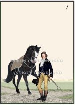
THIS one is the Rider. Finally.......
Bee
Still tinkering with this deck. I've fiddled with Tree, given it more realistic grass/ground. And changed the Heart card. Still not sure about the Rider.
Bee.
THIS one is the Rider. Finally.......
Bee
garmonbozia:-
It may be just the way that the card looks on my computer monitor, but the two images (man and horse) do not look very integrated on the card. They look too "photo-shoppy" to me. There's a perspective or shadowing issue that makes it look like the man was cut out of a magazine and pasted onto a card of a horse. I can't think of a better way to describe it.
.