Decadent Dream Tarot

gregory

has anyone who ordered this deck received it yet? I'd love to hear some first impressions...
Yes.

Beautifully produced, good card stock, nice reversible backs, excellent choice of images - BUT - several are weirdly squashed either vertically or horizontally. (Unless I completely misremember the works they are based on. But I don't.) SUCH a shame.

Three are attached; Hanged Man is the most startling, but I can't find an online version of the original. I can SORT of get why the 5 pents - but the fool....

And - yes I am picky - but some of the artists are spelt wrong in the book. That really gets to me. Klimt with a P in the middle - and a favourite artist of mine - Kay Nielsen spelt as Neilson... :mad:

I wish she had included the names of the WORKS she used and not just the artists.

But yes, I am glad I have it.
 

Attachments

  • 5 pentacles.jpg
    5 pentacles.jpg
    62.8 KB · Views: 345
  • DD fool.jpg
    DD fool.jpg
    61.8 KB · Views: 394
  • queen of rods.jpg
    queen of rods.jpg
    59.1 KB · Views: 389

delizt

thank you gregory, you have addressed the issue I have been wondering about...the "squashing" of the images!!!!

I have been looking at images online and couldn't tell if the perspective was off due to the internet, or if indeed the images were "squished" to fit the format of the deck, I see that they have...hmmmm

I am still on the fence, but thank you for answering my questions...the mistakes with the artist's names however IS a shame!
 

gregory

It seems so unnecessary, to me... :(
 

SarahJoy

Thanks for sharing, Gregory. I was somewhat interested at first. There's no way I could handle the effed up aspect radios, though. It awful to look at and disrespectful to the original work
 

SixDegrees

I think that this is a gorgeous and sumptuous deck overall, but the handful of oddly proportioned images are a deal breaker for me as well. The sad thing is, there is really no evident reason for them to be distorted. It seems like cropping the images differently would have been preferable. But, I'm no artist myself...
 

Dark Victory '39

I've been using this for about a month, and i have to say I've been impressed with it as a reading deck-- v. surprised, that. It's one of those curious little workers where even if you weren't a tarot reader the same three cards laid out in a different order creates a v. different emotional impression. I found myself being surprised that there's so much movement and energy to the images, not just a bunch of people looking at you.

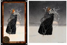
I agree it's totally bizarre that the titles aren't listed in the book as they contribute a lot of good reading fodder, as are all the other equally valid points Gregory mentioned that make this deck not as good as it really should be. (What's even weirder is that i looked at most of the cards again and again on this deck creator's site back in January and could see the disruptive vertical slant --yes, in the queen of wands and hanged man especially-- and thought, well i'm sure that wont be there in the actual cards. lol.) Duh, I guess i really should have asked. Though, if i had known about it ahead of time i might not have gotten it, and now that i have the deck am really enjoying it. The deck DOES have quite nice cardstock v. similar to sevenstars decks. And if anyone's curious it's the exact size of sevenstar's waterhouse oracle; so if you were to engage in some hanky panky between the two i don't think either deck would mind. Its been fun to shuffle in five or six random waterhouse oracle cards into the decadent dream and see what churns out. I have noticed too that there are a couple of the waterhouse cards with that slight verticalizaton: st. cecilia for instance (not as pronounced as the d.d's hanged man, etc) but it makes me wonder if there's a particular difficulty in the formatting of art? I know nothing about graphics and art so i'm speculating over something i know nothing of.

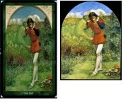
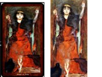
I'm very much enjoying the process of going on an online treasure hunt to put the titles of paintings to the cards; however, the downside is that you see often several different versions of the same painting, all tinted differently and some v. clear and I wonder if someone who knows these paintings really well, has seen them in person, or at least is very familiar to different full page size reproductions if they would be less satisfied with the carry-over to a 3x5 card. I noticed after i checked out the noakes book on waterhouse from the library that cards in that deck that seemed perfectly fine beforehand, leave the rightful impression (i suppose) that a shrunken image will not do justice to a large full coffetable book quality. It cant. Anyway, just wanted to add im surprised at how many times i've found myself reaching for the decadent dream over the past month given its imperfections. It's become something i crave to see in action.
 

daphne

The deck DOES have quite nice cardstock v. similar to sevenstars decks. And if anyone's curious it's the exact size of sevenstar's waterhouse oracle;

So this is also printed by Printerstudio? Is it mate or linen finish?
 

littlecat

I love the look of this deck particularly because it has Odilon Redon, one of my favourite artists as the Chariot. If you are ever in Paris a trip to the Musee de Orsay to see his work and all the other wonderful work there...impressionists etc...is just gorgeous
 

Dark Victory '39

I still really love this one, rylla. Slightly wonky-tilt aside. It conveys so much passion and strangeness. After using it for a while it stopped being an art-deck and became much more like something out of a dream; well, not like dreams I have, but like dreams i wish i had. =y scary & beautiful.

And the other thing i would add (again) is that it's just not a static deck. There's a ton of movement.