Día de los Muertos Lenormand. (Day of the Dead)

starlightexp

Once in the computer a very delicate dance goes on. When you scan something in for some reason it is never as vibrant as it is in real life. The way the bold colors really hit the light on and the rich tones of the paper are never quite the same. With Photoshop Elements I save each one as a TIFF file, because that is the best way to save art to be it’s truest form. Then I go about adjusting the colors and contrast until it gets to the brightness that it is in real life. After the first few cards one gets a feeling on what works best and this only takes about 20-30min. There are some tricks one learns to get things to look as amazing as they can but I don’t think ANYONE wants to hear about those, way to dry. As I have a printer in mind I move over to the template for them and resize the card and drop it in place and wait for inspiration to strike for the next card.
It’s really a pretty boring but I am so much in love with making this deck. The Coffin card was the first thing I ever drew with the pencils and The Key second so both have a special place for me. While Pixie was such a technical challenge to get right this one is a WHOLE different accomplishment. The Lenormand de Marseille is a hybrid of computer art and hand art so both are fulfilling in different ways.
 

Attachments

  • Finished.jpg
    Finished.jpg
    84.7 KB · Views: 192

starlightexp

So the deck is now over 1/3 done and rapidly approaching half. Being that I hope to get this deck out there in time for the summer months I've started to work with several print places to see what they can do.

For the non-deck designers out there this basically means downloading different templates from different publishing sites and ordering up samples to see how they play out. This, believe it or not has been a whole afternoons work to get done. This can take weeks to research to get a product that allows you to keep your deck the same dimensions you designed it in, get the color you want and be able to get it out there at a price that people can think is reasonable. Every place out there has their own way of wanting files sent to them. For some it is uploading images one by one, for others it's working in Photoshop with their files to get the cards placed in the correctly.

I learned with Pixie the best way to save files now it's going by the best route as to how to get them to other people. Hint for people working on art. Save the files as TIFF and at least 600ppi. Yes it is much larger then SOME companies out there need but there are many that allow you to go greater then the 300dpi for greater color accuracy and if your goal is to get your art to look as good as it can, that's the way to go. JPEG files are truly awful to work with because of the binary garbage that is put in by the computer to 'render' the image with needing the smallest amount of space. JPEGs are good for online because they are quick to load and can require very little space. Nothing looks as bad as a 'unconverted' JPEG when printed out. It looks smeary and grainy all at the same time.

While I loved the card stock for the other deck for this one I want something smoother with very rich saturated colors. I have a few sources that I was given by my brother who himself is a game tester and developer with one of the gaming companies out there. I even found one that looks willing to run up a different size template to suit my needs at no cost. Which is amazing if you have ever priced out custom templates.

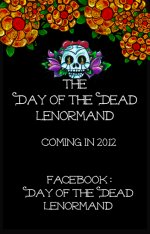
By starting this now and getting the samples in and getting color corrected it can cut down on the time between the finishing of the deck and offering deck by weeks. I sent off things to three different printers today. And not wishing to waist the possible good cards I designed up a promo back for the cards with information about the deck and how to get it when it comes out. This way it kills two birds with one stone really.

Interesting how this is more turning into the how-to blog of getting the deck made. I always thought that people would find this stuff boring.
 

Attachments

  • Promo back.jpg
    Promo back.jpg
    171.6 KB · Views: 194

Cat*

Interesting how this is more turning into the how-to blog of getting the deck made. I always thought that people would find this stuff boring.
Not at all! It's great to get an glimpse of your creation process - especially an illustrated one. I love seeing people's workspaces. Not to mention there's useful information in there as well. So thank you very much for sharing all that!
 

starlightexp

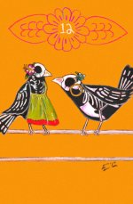
Well good to know :) I too love seeing how people work and getting a vibe for their spaces. Here one of the cards that have not made it's way online yet. It's the third version of it that has been done and now I think it's just right.
 

Attachments

  • The Birds.jpg
    The Birds.jpg
    134.5 KB · Views: 209

flying black kat

starlightexp

I am enjoying how you are sharing your creation processes. I am learning about different things that I had not even thought about.

Thank You.

Walk in Beauty.

Kathy
 

MoonGypsy

Edmund, Each new card has me continually swooning and i am so very happy that you are going to finish this deck and hopefully publish it...:*
Day of the Dead/Dia de los Muertos has been and continues to be very, very special to me...

Thank You! :love:
 

starlightexp

Day of the Dead/Dia de los Muertos has been and continues to be very, very special to me...

Ooooo is there a story there? Thank you so much for the kind words. The behind the scenes going on right now over this one is pretty crazy, but if all goes right the result will be well worth it. I'm hoping to be able to have it out for the Summer Solstice if nothing goes wrong
 

Alta

I am liking these cards more and more, but the Birds really turned the page for me. And, I had to look up what Day of the Dead even was. :)

I enjoy these discussions about the creation process. The availability of print on demand places has really changed the game for people who want to create decks.

x
 

starlightexp

There are hazards to doing your own art. Not the least of which is having to do the same image several times but even once you get it into the computer it’s just starting. For the last few days I’ve been more or less finalizing the art that I have done so that I feel that somethings on the project are finished. As I said in another post, putting it into the computer starts this very delicate dance. The image needs to look as much as like the original as possible without getting that ‘over cooked’ looked to it.
Never having worked with the pastel paper before has offered up it’s own set of challenges, because it could never be easy. The paper in order for it to work with the pastels needs to have a ‘tooth’ to it, that is a texture to pick up and hold the color. Like chalk there is a whole lot of dust going on when working on an image. This leads to one having very colorful hands and cloths when play time is done. Also what this means is that some of that extra dust, lands on the paper. While not really noticeable when one looks at the piece in real life when it is scanned into the computer it REALLY shows up.
Here comes the artistic choice: Leave the flaws there and ‘chalk’ it up to art. (oh man that is a bad pun...sigh.) Or reconstruct a background in the computer and use that.
I did my best to see about the clean up. I played with lighting, contrast,clone stamping, leprechaun dust and the unicorn fart filter but by the time I get the background cleaned to the point that I’m happy the rest of the image is a crispy mess of overdone computer tweaking that I can’t bear to look at. I thought of just scanning in a blank sheet of paper and then placing the image in. Did that but the tooth on the paper still has a very distinct shadow to it that was not the best to work with.

So I opted for the second option. Knowing that the place I want to make my deck will do it in the bridge size I like for a Lenormand I constructed 7 ‘paper’ backgrounds. These backgrounds are done at an insane 1200dpi. WAY more then I need, but I would hate to have to redo so much work at any given time so I always err on the side of caution and hey size does matter so I like to keep my files big. With photoshop I was able to have all 7 colors up on the screen at one time to make sure that they all play well in the pool. One is not brighter then another or the wrong hue to complement the next. To this I added a layer of what is called ‘dust’ . This is a good dust and gives the background very much the same texture as the paper I’m working with.

With that out of the way each image is now worked on, levels of contrast and the saturation of the tones are all given attention. Once the originals look as amazing as I think they can they are then dropped onto the new background and the old is simply erased. In some respects the image is put in separate from the top number motif. Reason for this is that I can sometimes make the image fill the card better having it in the exact size it needs to be. Then adding in the number banner afterwards helps to balance out the image.
 

Attachments

  • Before and after.jpg
    Before and after.jpg
    296.5 KB · Views: 177

nicky

That is fascinating ! Thank you for sharing that.