Freddie
Greetings All,
I finally recieved a deck that I have wanted for many many years. I cannot say how many auctions I have lost for a copy of this deck by Frankie Albano or US Games. I guess I became fascinated by it when I bought a Eden Gray book titled 'The Tarot Revealed' from a used paperback bookstore around 1984-85. FWIW, a great classic read.
http://www.amazon.com/Tarot-Revealed-Modern-Guide-Reading/dp/0451072057/ref=sr_1_4?ie=UTF8&s=books&qid=1249605647&sr=1-4
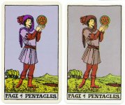
I'm glad I got it because I feel it has helped me reconnect to the deck that I originally loved. I wonder if Frankie Albano was or is a guy? I say this because us blokes care less about how colours contrast than women. I love all the colouring in this deck and I can actually see more detail in this one than the other versions. Can I call this a blokes deck lol...? For example in the 'six of Cups' you can clearly see a gentleman walking back up to the house:
http://www.albideuter.de/html/albano-waite_41.html
BTW, my deck is coloured much better than this scan. Mine is deeper blue.
This deck has the oddest lamination, looks and feels almost like wax...weird 60's- 70's flashcard / old maid feel, but good. A few of the cards are slightly off center...I don't mind...gives it character. I believe the colouring is darker from later editions by US Games that I have seen.
Le Fanu is correct in his judgement that this deck is worth seeking out.
Freddie
PS: Hollys' Rider Waite website is a great place to research the Waite-Colman versions!! I don't know if she lurks around here, but a thank you from me to her.
I finally recieved a deck that I have wanted for many many years. I cannot say how many auctions I have lost for a copy of this deck by Frankie Albano or US Games. I guess I became fascinated by it when I bought a Eden Gray book titled 'The Tarot Revealed' from a used paperback bookstore around 1984-85. FWIW, a great classic read.
http://www.amazon.com/Tarot-Revealed-Modern-Guide-Reading/dp/0451072057/ref=sr_1_4?ie=UTF8&s=books&qid=1249605647&sr=1-4
I'm glad I got it because I feel it has helped me reconnect to the deck that I originally loved. I wonder if Frankie Albano was or is a guy? I say this because us blokes care less about how colours contrast than women. I love all the colouring in this deck and I can actually see more detail in this one than the other versions. Can I call this a blokes deck lol...? For example in the 'six of Cups' you can clearly see a gentleman walking back up to the house:
http://www.albideuter.de/html/albano-waite_41.html
BTW, my deck is coloured much better than this scan. Mine is deeper blue.
This deck has the oddest lamination, looks and feels almost like wax...weird 60's- 70's flashcard / old maid feel, but good. A few of the cards are slightly off center...I don't mind...gives it character. I believe the colouring is darker from later editions by US Games that I have seen.
Le Fanu is correct in his judgement that this deck is worth seeking out.
Freddie
PS: Hollys' Rider Waite website is a great place to research the Waite-Colman versions!! I don't know if she lurks around here, but a thank you from me to her.

")