1987 Albano-Waite

gregory

??

My 1968 cards are FINE. Nice smooth lamination and the card doesn't strike me as flimsy....
 

Le Fanu

coredil said:
I really did not want to be the first to disturb the party.
Not really a question of wanting to disturb the party. My joy at the Printed in Belgium edition was in contrast to the Printed in Italy one which I had. The 1968 edition never even entered my equation; I doubt I'll ever find one so not much point pining over it.

But - hey - what are the two additional cards in the 1987 version you mention which I don't have?
 

Freddie

Cerulean said:
curious period because the coloring of an early period Hair album mimics the coloring of the green and red robust and eye-popping colors that you see in the Lovers card poster that comes with the original score.

I still like the U.S. Games reproduction of the "Tarot Productions circa 1968-70" version, though, especially in the mini-Waite small size--very handy!

Cerulean

Greetings,

Cool scans thanks for sharing. I wondered if some colours were missing from this deck. I've always wondered about the quality people / Mr Kaplan at US Games possibly being colour blind. Gregory do you mean the sun is oval on the backs? My 'The Sun' card is shaped ok. I quite like the wax type lamination and colouring of this version, because it reminds me of flower power days or of a victorian fun fair / carnival. My wife has fell in love with this deck and she doesn't even like Tarot. She called my 'Hudes' deck hard and harsh lol...... I think it is a masterpiece...goes to show ya' lol... I thought this deck would send people screaming due to colour contrast. BTW, I love the 10 of Pentacles card, but some cannot tolerate the red and green together..It's groovy man. Somedfay I'll get lucky and get a real 'Albano' deck, but for now I'm DIGGING this one honey child.

This has a colour scheme much like 1960's album art .
Cool blues, oranges, purples, greens and a very serene yellow.

http://www.we-buy-beatles.com/images/autographs/autograph4.jpg

http://www.botany.hawaii.edu/faculty/wong/BOT135/snds/hendrix.jpg

http://forsale.orconhosting.net.nz/pics/LPM1.jpg


Freddie
 

sapienza

I'd love to get the mini version of this deck. I expect they are impossible to find these days though.
 

coredil

Le Fanu said:
My joy at the Printed in Belgium edition was in contrast to the Printed in Italy one which I had.
OK I see your point.

Le Fanu said:
But - hey - what are the two additional cards in the 1987 version you mention which I don't have?
Oh, I guess I used the false word, these are only two advertising or title cards, but they have nice motives on them (see attached scans)

Abrac said:
Appreciate the picture coredil. It does seem that a lot of saturation got lost along the way, on that particular card at least. I actually like the muted tones so long as they're not too muted. It's hard to get a good overall impression from one card.

I've seen several different copies of the original, and while the colors are strong for sure, they too have drawbacks. Very often there is bleeding of colors. The stock is very flimsy and the edges of the cards have little bumps like they were punched out of a larger sheet. I didn't especially care for the finish, it's sort of a shiny plastic kinda like Modiano's decks.
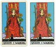
Like Gregory's my 1968 copy has a nice cardstock and does not feel flimsy at all.
I would say the most important difference is that because the later edition is a facsimile, the drawings are unfortunately not sharp.
Colors are not really very different except this kind of veil on it.
But the lack of sharpness is another thing!
I add two more scans where one can also see that the same overlap of color is on the facsimile (wands of the two of wands). Also one can see that the same white stains appear too (top left of the Queen of wands and under the right flower of the right wand on the 2 of wands)

Best regards
 

Attachments

  • AlbanoAdditional.jpg
    AlbanoAdditional.jpg
    101 KB · Views: 318
  • AlbanoQueenOfWands.jpg
    AlbanoQueenOfWands.jpg
    175.3 KB · Views: 292
  • AlbanoTwoOfWands.jpg
    AlbanoTwoOfWands.jpg
    144.9 KB · Views: 295

sapienza

Of course I want the original now! I'll add it to my impossible wish list where I have all the OOP stuff I know I'll probably never own.
 

Le Fanu

Thanks for the scans coredil. Quite a difference. How do they do it? I mean, when they reissued it, somebody must have been in the print room overseeing it. I mean, you don't do a facsimilie without comparing to the original and - like you say - there is a pallid veil over the colours.

r.e the extra cards; I got those with my high-gloss version, but I don't have them with my older, Belgian version.

And sapienza; the mini is still available as far as I know.. Playing Card Sales, amazon.... And a mini ain't heavy to send to Australia... })
 

sapienza

Le Fanu said:
And sapienza; the mini is still available as far as I know.. Playing Card Sales, amazon.... And a mini ain't heavy to send to Australia...

:laugh: Thank you, as always, for your enabling. For some reason I thought it was OOP. Do you know if the mini is printed in Italy? Either way, I think I'll sleep on it and decide in the morning :)
 

Freddie

Thanks for the extra scans!!!! I'll be on the look out for an original deck. I thought the Frankie Albano 78 card deck only came in playing size 2 1/2 by 3 1/2. I see I was wrong. They look to be slightly bigger than the US games version.

Thanks,


Freddie