Discussion Thread for: The Making of a New AT Collab Deck

Marirowana

One more thing tarotbear put up a template I printed it out and it's about 4 inches wide and 7 inches long I saw others recommending it so that is also confusing me because if that is the size we need to scan I've got to go back to the drawing board! Let me also add the pdf 900 x 1500 pixels sounds familiar to me I could do that on paint after loading picture. At this point I'm just really confused on what size to draw then what size after its on the computer!

I just see you added another question. Please stick to the sizes that are mentioned in the first post of this thread, your 2-1/2" wide by 4-1/16" tall is perfect. The template was just an example, before we decided on the actual sizes.

When you scan it, do it at the highest resolution possible, and the ratio will be good anyway. Not sure about the pdf and the pixels thing...
If you think it's right, you can send it in and if there seems to be something not right, you'll hear back from us.

I hope this answers all your questions.


You're welcome and thank you for asking, it shows us which things aren't clear ;)
 

Laura Borealis

Re: Borders

This might be an unpopular opinion, but for display online, I think our collaborative deck will look much better with NO borders. Just the card images. Let the art shine, don't box it in.

If it must have borders, please no grungy edges that overlap our art. * Please. I like that aesthetic on some decks, but I for one don't want stuff added to what I create. :neutral:

* I looked at the proposed borders again and I see the grunge doesn't overlap after all (it just appeared that way to me earlier... could have sworn! Hmm) Anyway my apologies on that, but I still don't like the grunge, it doesn't look right next to the clean, bright art of some of the cards.
 

daphne

This might be an unpopular opinion, but for display online, I think our collaborative deck will look much better with NO borders. Just the card images. Let the art shine, don't box it in.

If it must have borders, please no grungy edges that overlap our art. Please. I like that aesthetic on some decks, but I for one don't want stuff added to what I create. :neutral:

Actually, I agree. I am all-for-code-colored-suits-borders, but I just realized there is no need, indeed.
The deck is just digital, and it looks better on the screen without borders.
The only thing is we will need some minimal bottom place to write the name of the card.
 

tigerlilybug

Actually, I agree. I am all-for-code-colored-suits-borders, but I just realized there is no need, indeed.
The deck is just digital, and it looks better on the screen without borders.
The only thing is we will need some minimal bottom place to write the name of the card.

I would have to see each option before I could really make a decision but this topic has brought up some questions. Are we to put ranks and suits on the images or is that optional? If it is optional how /would it be added to our image if we left it out? Borders or no borders will the rank and suits be included no matter what?
 

daphne

I would have to see each option before I could really make a decision but this topic has brought up some questions. Are we to put ranks and suits on the images or is that optional? If it is optional how /would it be added to our image if we left it out? Borders or no borders will the rank and suits be included no matter what?

There is no "must" in your artwork, you can do it as you please. No need to include ranks and suit in the art, because there will be titles added post-creation, in an uniform way by our technical angel, Annabel.

Thus, there will be a border, maybe a minimal one. Or just at the bottom, as the last decks from Llewellyn, where the card name will be written.
 

tigerlilybug

There is no "must" in your artwork, you can do it as you please. No need to include ranks and suit in the art, because there will be titles added post-creation, in an uniform way by our technical angel, Annabel.

Thus, there will be a border, maybe a minimal one. Or just at the bottom, as the last decks from Llewellyn, where the card name will be written.

Thanks for the info, I think I'll leave it to Annabel :) I don't think it would fit well if I added rank and suit to my image at this point I am almost finished and didn't leave much room for it.
 

daphne

Thanks for the info, I think I'll leave it to Annabel :) I don't think it would fit well if I added rank and suit to my image at this point I am almost finished and didn't leave much room for it.

Dont worry, no need to crowd some suit sign in the card. You can see in the few cards already done, there is no rank and suit name in the image.
 

Marirowana

Card borders?

There are some questions about the borders, in the progress thread and in this thread. Some people said it will be better without borders because it won't be printed and the artwork will look better on the screen without a border... But many people will print their own copy, and the majority wants uniform borders according to the poll, so there will be borders (and titles) added by one person, after we all individually made our cards. But, what should they look like?

My question for all of you is:
-Do you want simple black or white borders?
-Or something more fancy, like this, made by seven stars.

(if you prefer the latter, see for more examples seven star's post below :) )


Personally, I like something in between :) I like that border style and font, although I also like a slightly thinner border. Also, we have to consider that there are many modern style cards, and those borders might look odd with those images. Vintage but a little bit more neutral would be perfect, I think.


Seven stars is going to make the card backs, thank you for that! :)

.
 

truelighth

I absolutely love the borders that on those cards that are shown. I guess that is the border Seven Stars made? I think borders give a deck like this a more uniform feel. And it is a place to actually place the titles.

Such a pity that it won't be printed, but we do have to respect Solandia's wishes.
 

seven stars

I absolutely love the borders that on those cards that are shown. I guess that is the border Seven Stars made? I think borders give a deck like this a more uniform feel. And it is a place to actually place the titles.

Such a pity that it won't be printed, but we do have to respect Solandia's wishes.

Ya I was thinking that sounded like a nightmare, I wouldn't have touched it either haha!

For the borders, if you want me to send you ideas/graphics I'd be happy to!! Love doing this sort of thing.

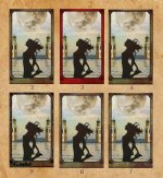
The deal with borders is (1) the design, (2) color & effect (3) font.....how about if whoever puts all these together chooses the font. For the design part, here's an example of one design with 6 different color/effects. If you decide on what design, the color & effects are infinite.

I totally agree that borders add uniformity, especially for a deck that's all over the place with images.
 

Attachments

  • 2 - 7.jpg
    2 - 7.jpg
    106.8 KB · Views: 82