Crystal Tarots by Elisabetta Trevisan

Dee Ell

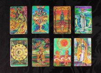
The art on these is beautiful, but I'm wondering if anyone who owns the deck finds the images to be small? (It's annoying that so many decks with breathtaking art are printed on small cards and then the images are shrunk even more to accommodate a border around them)

http://www.aeclectic.net/tarot/cards/crystal-tarots/

Do you have any other opinions you'd like to share on the deck?

(I have another thread regarding out-of-print decks I love (here: http://www.tarotforum.net/showthread.php?t=213075 ) but they're way too expensive and also more "out there" decks, so I'm looking again at some of the more traditionally-based decks I was attracted to that might be better for an absolute beginner (but fast learner) like myself... although looking at the reviews of this deck again, I see that people say it's *not* a good beginner deck... Why are all of the decks I'm drawn to so "out there"? :p (I'm also really drawn to "Roots of Asia" and "Via"))
 

rwcarter

The best beginner deck is the one you feel drawn too. :) If you're not drawn to the art, you're never going to use the deck. While I have an appreciation for the Rider Waite now, I would likely have never picked up tarot if that were the only deck available for me to use.

One reason folks are probably advising against the Crystal Tarots though is that the Minors don't adhere to the Rider Waite system, but the much more rarely used Eudes Picard system. So if you did use this as your first deck and then you went on to use a deck in the RWS school, you'd basically be back at ground zero having to unlearn everything you learned in using this deck.

Rodney
 

Aerin

I managed to get hold of the original (well OOP) Majors-only deck recently, where the images aren't chopped off. It's beautiful - but I looked for over ten years for it!

I wish LS would publish it again in that format. Maybe we could nag?

Here's a thread with links to some pics http://www.tarotforum.net/library/15/2002-12/i-tarocchi-di-vetro-20021225.shtml

I agree with Rodney that it might not be the best beginners deck. It's lovely art though and there is no harm in having both types - decks you get for art and decks you get for reading. It often doesn't work out the way you think it will once you get hold of the deck though.
 

Dee Ell

I wish LS would publish it again in that format. Maybe we could nag?

:) Does nagging them ever work? If so, I would be happy to further the cause!! ;)

(this deck DESERVES to be larger and borderless - I've seen the trimmed images people have posted elsewhere and they're gorgeous, though undoubtedly *tiny*)
 

Le Fanu

Surely this must be one of their big sellers simply by dint of being in print for so long. It is one of my favourites.

I have the majors only one too but I find the colours in the (most recent) standard more vibrant.

It would be truly wonderful if it were larger. Or not even larger, just borderless. Like the Illuminati.
 

Dee Ell

Surely this must be one of their big sellers simply by dint of being in print for so long. It is one of my favourites.

I have the majors only one too but I find the colours in the (most recent) standard more vibrant.

It would be truly wonderful if it were larger. Or not even larger, just borderless. Like the Illuminati.

Glad to hear at least they're printing the colours vibrantly (I've heard some are greyed out) but yes, it does need to be borderless. I emailed Lo Scarabeo and asked them if they were considering publishing it without borders or a larger deck. We'll see if I get a reply ;)
 

agviz

Le Fanu convinced me to trim the Crystal, and it's the only way to go. This is how Lo Scarabeo should print the deck (but larger). And they should gild the edges. And they should make a little book box, something like this (see pictures).

Furthermore, the cards aren't equally vibrant across the deck (I have the printing with the woman on the box front). Some are dull and really should be corrected for future printings. But the deck is still a gem even as is. One that's worth polishing a bit more though.

I don't recommend it as a first deck for the reasons already mentioned, but I do love it all the same.
 

Attachments

  • Crystal1.jpg
    Crystal1.jpg
    90.6 KB · Views: 1,078
  • Crystal2.jpg
    Crystal2.jpg
    156 KB · Views: 3,758
  • CrystalBook1.jpg
    CrystalBook1.jpg
    96 KB · Views: 1,059
  • CrystalBook2.jpg
    CrystalBook2.jpg
    92.9 KB · Views: 1,125

Le Fanu

Oh gosh yes, trimmed is taken as read. I forget there are still people who have it hemmed in by white borders. I have two trimmed ones, now the size of a pocket RWS.

You say the printing with the woman on the box front agviz, but I have seen quite a few different boxes and one has the Temperance card on the front (more recent = better) plus a blue LoS/Fabbri/Orbix box with the Queen of Cups on the front. Not so good. I guess it's the Temperance box you're refering to.

Gorgeous deck. I can only dream of it in "Professional size!"

By the way; have you noticed how some of the signatures are back to front? They could correct that while they're at it!
 

agviz

Actually I have the most recent box shown in your very nice write up on the Crystal. So maybe I'm just being ultra picky. As a graphic artist, I can be that way sometimes. Although I didn't have the sharp eyesight to catch the backwards signatures.

And speaking of your article, I hope you won't mind my posting a link to it here; it may be of help to anyone considering the Crystal. I really like the Temple Garden comparison!
 

Aeric

When we were organizing decks by elements, I chose the Crystal Tarots to represent water. The lavish use of blues and greens and the glassy style of the art make the cards appear as though submerged underwater. Artwork from Atlantis.