greatdane
I now have more Lenormand decks than I have tarot decks. I do a lot of readings and thought I would share my thoughts about the decks I have and invite others to do the same.
You can list ALL positives, this is just an opportunity to share your thoughts about decks for others perhaps on the fence about a particular deck, to give them more information.
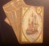
Lenormand Oracle by Gina di Roberto -
PLUSES
INEXPENSIVE (I got through Book Depository, which does run out and you have to wait for it to come back in, but it was about 9 dollars including shipping when I got mine)
IMAGES - really love the images based on an old deck, but cleaned up and brightened a bit
I also love it JUST has the images, no card inserts, no verses. I also love it is very easy to see what the image is.
CARDSTOCK - love the cardstock! Especially for such an inexpensive deck, the cardstock is really quite nice. Shuffles easily, not TOO glossy and not "sticky".
BACKS - While backs are the biggest part of a deck choice, this has lovely backs imo. Not too bright or too dull, they seem to match the deck.
MiNUSES -
If there were anything I would change, it would be to not have the white borders. To either make the image larger and not have the white borders or just to eliminate the white borders. But not a big deal.
The other thing would be to elevate the images a bit. It is pretty obvious they just removed the card insert from the top, so it doesn't look QUITE as balanced as it could, but NOT a big deal.
OVERALL...I LOVE THIS DECK! I have TWO.
MYSTICAL LENORMAND
PLUSES
COLORING I really love the colors in this deck. I find the muted purples throughout very appealing. The colors just work for me and are different from any other deck I've seen.
IMAGES - ok they are both a plus and a bit of a minus to me, and I will put the pluses here.
LOVE the quirky images. There is a magical feeling to them. I really love all the images (although some I had to get used to, but that will be in the minuses).
CARDSTOCK. Easy to shuffle, more of a satin finish, not a really laminated, sticky feeling to them. Lovely quality.
BACKS - OK THIS is one of the BIG pluses to me. I love the backs. The angels and stars, the coloring, all works for me.
MINUSES -
IMAGES - OK they are a little busier than I normally like and include images not really needed. At first I thought the RING was the BIRDS card because the BIRDS seem more predominant. But I have trained myself, really easily, to just focus on the main image, so have no problem reading with them. A newbie to Lenormand may not find this the best first deck. So, fairly busy and some strange images, especially for someone new to Lenormand.
BORDERS - I would have been happier had they expanded the actually image and gotten rid of the white borders. Not a big fan of white borders anyway, but with a small deck, I think so much better to just make the images bigger and lose the white border.
OVERALL - I personally really like this deck, but I think is the type of deck you really like or really don't because it is very different.
VINTAGE GERMAN LENORMAND
PLUSES
IMAGES - LOVE the images! It definitely has an old feeling as it's from an old deck. Seven stars did a fabulous job. I find it very easy to read with (same basic images used in the Lenormand Oracle, but more balanced so it doesn't look like the insert was just removed). LOVE THE IMAGES and way they were done.
CARDSTOCK - lovely linen stock, easy to shuffle.
BACKS - I LOVE you can choose different backs. I have two of these decks, with different backs and since backs are important to me, this is a big plus.
OVERALL, love this deck and use it often, rotating between the two I have.
SAMHAIN LENORMAND
IMAGES - JUST LOVE what sevenstars did with these basic images used in the Vintage German to make them a little more dark and gothic. It's like reading in a swamp at midnight. Lovely vibe. She changed some cards quite a bit. Very readable.
STOCK - same cardstock, the linen, from the Vintage German Lenormand. Lovely to shuffle. I put about four coats of the VINTAGE PHOTO distress ink on the edges and it just really made it pop even more and add an even older look to it.
BACKS - Love the GOTHIC backs. Just so goes with the deck.
OVERALL....LOVE this deck which I tend to use more at night. I don't see it as seasonal, reads well all year because the images are not that tied into Halloween, but I do see it as more of a night deck. Very atmospheric.
BIERI
PLUSES -
IMAGES - I actually love these images. They're different with a gypsy vibe. They can take a little getting use to (which I will write about in minuses). I love the black background. Love the size as I can clearly see images.
CARDSTOCK - I find the stock very good. More of a satin finish. Sturdy. Very easy to shuffle and again, love the size, they are the size of most regular tarot decks.
MINUSES -
IMAGES - They take a little getting used to. I can now easily tell the cards apart, but when first looking at them, the images were not all as obvious as in many other decks. I would not recommend this for someone brand new to Lenormand.
BORDERS - THIS SO could have been done without the white border. Would have made them more dramatic (I don't like to try to trim my decks, but this would definitely be one I would trim if I were handier).
BACKS - OK one of my least favorite backs. Geometric tan and black shapes. Don't really work for me as a back, but I love the deck so I overlook it.
OVERALL really like the deck, use it a lot, but I don't think it's for everyone. It is DIFFERENT in images, size, and style from many Lenormands.
LILAC TWILIGHT (ORIGINAL RUSSIAN, ALL in RUSSIAN) -
PLUSES
IMAGES - LOVE THE soft muted colors in this deck. Even though it is a compilation of images found online, they all seem to work well and I find the deck very cohesive. BORDERLESS which is very nice") .
.
STOCK - LOVE this cardstock. One of the only really glossy decks I like. It doesn't feel sticky or smell funny like many glossy decks. Shuffles easily.
BACKS - BEAUTIFUL backs in shades of purple and pink mostly. Butterflies.
OVERALL ONE OF MY FAVORITE LENORMANDS. Not easy to get your hands on without spending a lot. I was lucky and got from a kind ATer for an Amazon card (THANKS EMMSMA!)
LILAC TWILIGHT (part of the LILAC/CHERRY COMBO) -
First, I sold the Cherry, beautiful deck, but it was a little counter to how I see the images.
PLUSES -
IMAGES -
Beautiful images, some of which are similar to those in the original, many not. These do have a small lacy kind of lilac border, but it's not intrusive and I don't mind it. The images are clearer than in the original Lilac (that deck looks more misty).
CARDSTOCK - very different from the original. This is more a satin. Doesn't feel laminated.
Very easy to shuffle. Not flimsy stock, seems pretty substantial, but don't know if you used it a lot every day how the edges would stand up.
BACKS - Similar, but slightly different, to the butterfly pattern on the original.
OVERALL I use this deck a lot. Probably more than the original, although I LOVE the original. This one just shuffles a little easier and when you're doing a lot of readings, that helps.
That's it for now. I'll add more later. Anyone have any decks to add? Comments?
You can list ALL positives, this is just an opportunity to share your thoughts about decks for others perhaps on the fence about a particular deck, to give them more information.
Lenormand Oracle by Gina di Roberto -
PLUSES
INEXPENSIVE (I got through Book Depository, which does run out and you have to wait for it to come back in, but it was about 9 dollars including shipping when I got mine)
IMAGES - really love the images based on an old deck, but cleaned up and brightened a bit
I also love it JUST has the images, no card inserts, no verses. I also love it is very easy to see what the image is.
CARDSTOCK - love the cardstock! Especially for such an inexpensive deck, the cardstock is really quite nice. Shuffles easily, not TOO glossy and not "sticky".
BACKS - While backs are the biggest part of a deck choice, this has lovely backs imo. Not too bright or too dull, they seem to match the deck.
MiNUSES -
If there were anything I would change, it would be to not have the white borders. To either make the image larger and not have the white borders or just to eliminate the white borders. But not a big deal.
The other thing would be to elevate the images a bit. It is pretty obvious they just removed the card insert from the top, so it doesn't look QUITE as balanced as it could, but NOT a big deal.
OVERALL...I LOVE THIS DECK! I have TWO.
MYSTICAL LENORMAND
PLUSES
COLORING I really love the colors in this deck. I find the muted purples throughout very appealing. The colors just work for me and are different from any other deck I've seen.
IMAGES - ok they are both a plus and a bit of a minus to me, and I will put the pluses here.
LOVE the quirky images. There is a magical feeling to them. I really love all the images (although some I had to get used to, but that will be in the minuses).
CARDSTOCK. Easy to shuffle, more of a satin finish, not a really laminated, sticky feeling to them. Lovely quality.
BACKS - OK THIS is one of the BIG pluses to me. I love the backs. The angels and stars, the coloring, all works for me.
MINUSES -
IMAGES - OK they are a little busier than I normally like and include images not really needed. At first I thought the RING was the BIRDS card because the BIRDS seem more predominant. But I have trained myself, really easily, to just focus on the main image, so have no problem reading with them. A newbie to Lenormand may not find this the best first deck. So, fairly busy and some strange images, especially for someone new to Lenormand.
BORDERS - I would have been happier had they expanded the actually image and gotten rid of the white borders. Not a big fan of white borders anyway, but with a small deck, I think so much better to just make the images bigger and lose the white border.
OVERALL - I personally really like this deck, but I think is the type of deck you really like or really don't because it is very different.
VINTAGE GERMAN LENORMAND
PLUSES
IMAGES - LOVE the images! It definitely has an old feeling as it's from an old deck. Seven stars did a fabulous job. I find it very easy to read with (same basic images used in the Lenormand Oracle, but more balanced so it doesn't look like the insert was just removed). LOVE THE IMAGES and way they were done.
CARDSTOCK - lovely linen stock, easy to shuffle.
BACKS - I LOVE you can choose different backs. I have two of these decks, with different backs and since backs are important to me, this is a big plus.
OVERALL, love this deck and use it often, rotating between the two I have.
SAMHAIN LENORMAND
IMAGES - JUST LOVE what sevenstars did with these basic images used in the Vintage German to make them a little more dark and gothic. It's like reading in a swamp at midnight. Lovely vibe. She changed some cards quite a bit. Very readable.
STOCK - same cardstock, the linen, from the Vintage German Lenormand. Lovely to shuffle. I put about four coats of the VINTAGE PHOTO distress ink on the edges and it just really made it pop even more and add an even older look to it.
BACKS - Love the GOTHIC backs. Just so goes with the deck.
OVERALL....LOVE this deck which I tend to use more at night. I don't see it as seasonal, reads well all year because the images are not that tied into Halloween, but I do see it as more of a night deck. Very atmospheric.
BIERI
PLUSES -
IMAGES - I actually love these images. They're different with a gypsy vibe. They can take a little getting use to (which I will write about in minuses). I love the black background. Love the size as I can clearly see images.
CARDSTOCK - I find the stock very good. More of a satin finish. Sturdy. Very easy to shuffle and again, love the size, they are the size of most regular tarot decks.
MINUSES -
IMAGES - They take a little getting used to. I can now easily tell the cards apart, but when first looking at them, the images were not all as obvious as in many other decks. I would not recommend this for someone brand new to Lenormand.
BORDERS - THIS SO could have been done without the white border. Would have made them more dramatic (I don't like to try to trim my decks, but this would definitely be one I would trim if I were handier).
BACKS - OK one of my least favorite backs. Geometric tan and black shapes. Don't really work for me as a back, but I love the deck so I overlook it.
OVERALL really like the deck, use it a lot, but I don't think it's for everyone. It is DIFFERENT in images, size, and style from many Lenormands.
LILAC TWILIGHT (ORIGINAL RUSSIAN, ALL in RUSSIAN) -
PLUSES
IMAGES - LOVE THE soft muted colors in this deck. Even though it is a compilation of images found online, they all seem to work well and I find the deck very cohesive. BORDERLESS which is very nice
.STOCK - LOVE this cardstock. One of the only really glossy decks I like. It doesn't feel sticky or smell funny like many glossy decks. Shuffles easily.
BACKS - BEAUTIFUL backs in shades of purple and pink mostly. Butterflies.
OVERALL ONE OF MY FAVORITE LENORMANDS. Not easy to get your hands on without spending a lot. I was lucky and got from a kind ATer for an Amazon card (THANKS EMMSMA!)
LILAC TWILIGHT (part of the LILAC/CHERRY COMBO) -
First, I sold the Cherry, beautiful deck, but it was a little counter to how I see the images.
PLUSES -
IMAGES -
Beautiful images, some of which are similar to those in the original, many not. These do have a small lacy kind of lilac border, but it's not intrusive and I don't mind it. The images are clearer than in the original Lilac (that deck looks more misty).
CARDSTOCK - very different from the original. This is more a satin. Doesn't feel laminated.
Very easy to shuffle. Not flimsy stock, seems pretty substantial, but don't know if you used it a lot every day how the edges would stand up.
BACKS - Similar, but slightly different, to the butterfly pattern on the original.
OVERALL I use this deck a lot. Probably more than the original, although I LOVE the original. This one just shuffles a little easier and when you're doing a lot of readings, that helps.
That's it for now. I'll add more later. Anyone have any decks to add? Comments?