
jmd
Le Soleil has, on the whole, much that is consistent across Marseille-style decks.
But let's have a look at those important two standards, the Dodal and the Conver:
Two really clear and obvious differences are in the number of droplets represented, and in the rays emanating from the Sun itself.
With regards to the number of droplets, this varies even across various versions from the Payen family (I'll talk about these in another post), so perhaps is simply an indication as to aesthetic inclusion and amount of space they hold.
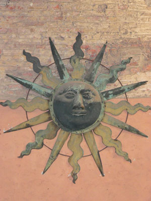
The curved rays on the Conver are reminiscent of the similar pattern used by the Visconti family. For example, in the Castle in Parma is a large copper Sun in a stair-case:
Another distinction are the lined-rays between the main days appearing on the Conver. Here it seems that the woodcarver very carefully indeed went to the trouble of ensuring that these were straight and clear.
The general stance of the two individuals is similar, and in each case the one on the right-hand of the card appears to be on some kind of raised ground.
The Dodal appears to have been taken from an earlier model to which the name panel has been added, resulting in one foot from each individual being 'cut' off. Here Fulgour also brings to our attention (in another thread) that the horizontal line on the Dodal is not a single one, but rather stops and starts at precisely where the leg lines of the right-hand person's 'removed' foot.
I have used, by the way, an enhanced copy of Kenji's personal original Conver deck for this constrast exercise, and that for one very important detail... look at the numbering!
But let's have a look at those important two standards, the Dodal and the Conver:
Dodal ->
 Conver ->

Two really clear and obvious differences are in the number of droplets represented, and in the rays emanating from the Sun itself.
With regards to the number of droplets, this varies even across various versions from the Payen family (I'll talk about these in another post), so perhaps is simply an indication as to aesthetic inclusion and amount of space they hold.
The curved rays on the Conver are reminiscent of the similar pattern used by the Visconti family. For example, in the Castle in Parma is a large copper Sun in a stair-case:
Another distinction are the lined-rays between the main days appearing on the Conver. Here it seems that the woodcarver very carefully indeed went to the trouble of ensuring that these were straight and clear.
The general stance of the two individuals is similar, and in each case the one on the right-hand of the card appears to be on some kind of raised ground.
The Dodal appears to have been taken from an earlier model to which the name panel has been added, resulting in one foot from each individual being 'cut' off. Here Fulgour also brings to our attention (in another thread) that the horizontal line on the Dodal is not a single one, but rather stops and starts at precisely where the leg lines of the right-hand person's 'removed' foot.
I have used, by the way, an enhanced copy of Kenji's personal original Conver deck for this constrast exercise, and that for one very important detail... look at the numbering!


