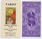
The Lo Scarabeo Centennial "Pam B?"
Dear Roppo and others,
I have checked as of late May 2010 and compared the LS Konigsfurt Urania version with my "Pam A" reproduction.
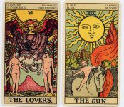
My Lo Scarabeo really looks like the samples you posted here from the beige coloration of the grays and whites down to the Sun lack of squiggle line--my opinion there's more of a Pam B look to my LS deck.
Of course
the Sun face is a Pam A with suspicious extra yellow rays put on top so there is 24 instead of the expected 22. I will have to check other threads to see if there was an LS posting by Ric on the Sun alterations.
Of course the Japanese edition has the original PCS fonts and titles or lack of them. My LS has the different coloring and computerized fonts on every card, which I am guessing makes it "unique" enough to be different than any Urania or other RWS reprints.
and the funny Sun edits...etc.
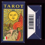
I bought my LS from Alidastore.com.
----------earlier-------------
I ordered one and will check with my slimmer Fabbri-issued LS Secrets for size, card stock, etc. I know I liked the smaller size of the LS Secrets and the coloring--seemed richer and darker to me for some reason. Could be because it was somewhat smaller.
Since the Pam-B coloring on the Original edition printed in Belgium is a favorite Springtime version of the old deck right now...I'm glad you posted on this edition! I didn't need much to make this part of a 'birthday' selection 8).
If my LS Centennial has the same backs, publishing data and slimmer size, I'll post here--then we will all know a little better about your unique deck!
Cerulean