Abrac
roppo, that's pretty strong evidence. ")
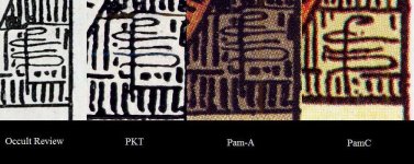
roppo, it seems that the link to the signatures comparison picture does not work anymore.roppo said:I mean the "which is earlier" question between Pam-A and Pam-B can be settled by examining their degree of difference from the original drawing. And PCS monograms are the best measure for the purpose because we know what shape they have to take exactly. For the illustration :
http://grimoire.blog.ocn.ne.jp/doll/files/pcssignatures.jpg
The PCS monogram in the OR is the starting point: well defined letters, no breaking of lines.
PKT and Pam-A both have same line-breaking, but their direction of lines are not far from OR one. Pam-C PCS monogram shows considerable derogation: P is deformed, S is not done by one stroke. These features suggest a presence of copyist and the absence of Pixie.
Works for me.....coredil said:roppo, it seems that the link to the signatures comparison picture does not work anymore.
Could you update it please?
Best regards
Just out of curiosity, have you read the whole essay from Pietro Alligo?Teheuti said:It seems strange to me that there is such a controversy when the evidence is so clear. The biggest clarification in the last couple of years has been over the Rose-and-Lilies versus Crackle-back Pam-A (including the slight trimming of the original image and the discovery of the April 1910 date for a printing on better paper).
All good questions for which I don't have definitive answers. Alligo is very convincing except for the "oops-line". A stone wouldn't crack as he describes. From a symbolist pov it is obvious that an additional ray is necessary to the symbolism of the card.coredil said:Just out of curiosity, have you read the whole essay from Pietro Alligo?
It is quite interesting and he mentions several other reasons beside the cracked stone for his theory.
How would you explain that the Rose and Lilie deck has the Shit linie, the Pam B does not have it and then the Pam C has it again?
Also how would you explain that the line drawings and card titles of the PKT (which are the same as those of the A deck) stayed the same from the beginning until today but the line drawings of the B and C differs completely?
Best regards
coredil said:roppo, it seems that the link to the signatures comparison picture does not work anymore.
Could you update it please?
Best regards