
trzes
Recently I started working on a slightly modernized Mamluk cards recreation. My reference is a copy of the mulùk wa-nuwwàb reproduction published by Aurelia Press (Series B). There is a good introduction to Mamluk cards on Andy Pollet’s site: http://l-pollett.tripod.com/cards64.htm
I don’t attempt to faithfully repaint every detail of the existing cards but rather try to use the principles that I think define the Mamluk pattern and to recreate the cards from scratch. In my book repeated abstract patterns (including more or less floral patterns), many symmetries and mathematically constructed forms (like parts of perfect circles) are an important part of the “spirit” of the cards. What I also would like to achieve is a consistent look and feel of all the cards. The Aurelia press reproduction is based on 47 cards thought to be part of three different decks. Some of the card had to be recreated to make a full deck of 52 or even 56 cards. This leads to a quite heterogeneous feel for the whole deck.
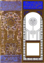
I haven’t got very far yet though. There are borders for pips and courts. And there is an incomplete king of coins (see attached images). And there are already many things up for discussion, I think.
The borders of the existing cards are in fact bronze/brownish for the pips and golden for the courts. But that may well be a result of the different decks these cards come from. Using different colors is closer to what there is but leads to a less unified look. I still somehow prefer different colors.
My major issue with the existing cards is these large blue patches of blue with Arabic calligraphy that cover tops and bottoms of the court cards. I think it is quite obvious that those are later additions, but couldn’t find anything about it online. Some reasons in favor of my theory: First, the bottom patch is missing on the 2nd vice King of polo-sticks. Second, on some cards the patterns of the rest of the card is shining through (see 3rd attached image). Third, and most crucial for me, when looking at the whole cards without the blue bits, the rest of the cards that is not blue look quite incomplete and imbalanced. Therefore I am in favor to leave out the bottom blue patches entirely and restrict the top blue patches to an area that seems to have been left out in the first place.
Does this whole approach make any sense for you? Or is it all going to be too stiff and too formal, using a vector graphics program to “construct” the cards rather than to actually draw them?
Thanks for any feedback.
I don’t attempt to faithfully repaint every detail of the existing cards but rather try to use the principles that I think define the Mamluk pattern and to recreate the cards from scratch. In my book repeated abstract patterns (including more or less floral patterns), many symmetries and mathematically constructed forms (like parts of perfect circles) are an important part of the “spirit” of the cards. What I also would like to achieve is a consistent look and feel of all the cards. The Aurelia press reproduction is based on 47 cards thought to be part of three different decks. Some of the card had to be recreated to make a full deck of 52 or even 56 cards. This leads to a quite heterogeneous feel for the whole deck.
I haven’t got very far yet though. There are borders for pips and courts. And there is an incomplete king of coins (see attached images). And there are already many things up for discussion, I think.
The borders of the existing cards are in fact bronze/brownish for the pips and golden for the courts. But that may well be a result of the different decks these cards come from. Using different colors is closer to what there is but leads to a less unified look. I still somehow prefer different colors.
My major issue with the existing cards is these large blue patches of blue with Arabic calligraphy that cover tops and bottoms of the court cards. I think it is quite obvious that those are later additions, but couldn’t find anything about it online. Some reasons in favor of my theory: First, the bottom patch is missing on the 2nd vice King of polo-sticks. Second, on some cards the patterns of the rest of the card is shining through (see 3rd attached image). Third, and most crucial for me, when looking at the whole cards without the blue bits, the rest of the cards that is not blue look quite incomplete and imbalanced. Therefore I am in favor to leave out the bottom blue patches entirely and restrict the top blue patches to an area that seems to have been left out in the first place.
Does this whole approach make any sense for you? Or is it all going to be too stiff and too formal, using a vector graphics program to “construct” the cards rather than to actually draw them?
Thanks for any feedback.


") It might not have the authentic feel of the originals, but it can be a beautiful deck in its own right - not pretending to be a restoration, but rather a 'Mamluk-inspired' deck. Not to mention the great value of your personal learning, experience, exploration, and discovery of this (or these?..) gorgeous deck.
It might not have the authentic feel of the originals, but it can be a beautiful deck in its own right - not pretending to be a restoration, but rather a 'Mamluk-inspired' deck. Not to mention the great value of your personal learning, experience, exploration, and discovery of this (or these?..) gorgeous deck. 
 And I like the thought that the people who created the mamluk cards in the first place might have done the same if the technical tools had been available back then. Pure speculation of course.