Artistic Skill, Aesthetics in the Thoth and other "GD-inspired" Decks.

yogiman

One might also point out the highly class-conscious nature of society at the time of these decks' creation, and that many of these figures were well-born -- or liked to make a pretense thereof (Crowley and both Mathers are great examples of "wannabe" hoi aristoi).

Me too. :smoker:
Aleister Crowley, Samuel Liddell MacGregor Mathers and Lady Frieda Harris prove to me that perfection is for the gods, and furthermore that they have left room for improvement to us.

And I do love the Rosetta.
I thank Grigori for alerting me to the Rosetta deck, the existence of which confirmed to me that I didn't go too far by asserting that the Thoth deck breathes a very male adolescent atmosphere. Apparently, time felt the need to restore some balance by motivating the creator of the Rosetta deck to paint a female version of it.
 

Kingdubrock

I can't comment on the role of aesthetics in GD decks, since I don't have many of them myself and have only just looked at online previews.

What I can say is that I'm really picky about the artwork in my decks, it has to look good in some way otherwise I just get unfocused and get put off by the flaws. Most decks I've enjoyed haven't had 100% perfect artwork, but their flaws were such that I could still appreciate them.

I tend to like elaborate decks with lots of tiny details on each card, but one thing I've noticed is that this doesn't always mean artistic skill. There are some decks with artwork that must have taken a lot of time to make, but which looks like someone in a beginner's life drawing class would do, and which looks rather wonky in an annoying way. I haven't found many simplistic decks I liked but I assume the reverse would be true for them -- wsome simplistic decks may look genuinely nice and the sort of thing I could love.

That's also true of art in general, I think. It happens too often that artwork that is more simplistic because it's abstract or because it's in a more untrained style ends up being an excuse to not put that much effort or skill into it. However, there are many good pieces that fall into those categories but their simplicity is deceptive, because once you look closer, you can see how it's beautiful or thought-provoking or downright awesome.

Nice post. Its very direct and to the point, yet touches on the subjective as well.

Like, I fully admit to detsting the Thoth Fool card. YUCK. That face, that gaze, the pug nose, the green giant costume, the (in my opinion) ridiculous pointed shoes. To me its a case where they murdered one of the most important cards - regardless of what meaning they intend to convey. Yogiman mentioned somewhere that Crowley viewed the Fool card of the Marseilles deck as infantile. So it would appear, subjectively to me, without studying his attributions or descriptions of the card, that Crowley feels the Fool should be repulsive, repellent, somewhat threatening and ominous (and reminiscent of the Joker from Batman comics or something). My reaction is thats great for Crowley, but to suggest this energy is more important or true than the utility and flexibility and openness to multi-layered meaning contained in the Marseille image to me does enromous violence to the original tradition, which would appear to be only partially understood. Bear in mind, please, that this is my subjective reaction to this card, based on personal aesthetics and preferences, and how this can affect people and their relationship to the cards. Its far from arbitrary or secondary/tertiary importance.

Also your post imo, relates to the subject of mastery that I have been blabbering about. Conscious reduction of detail, realism, or effort is in large part discernable from inability to produce these things. To be fair, its not inherently necessary for one to BE able to produce more realism or detail, or work harder in order for them to reduce or abstract conceptually and then represent what they are trying to say with whatever skill or means they have. Still, sufficient clarity of purpose would needed for communication of the desired message.

If we compare the simplicity of Cocteau's vs Rebrandts drawings, it should be apparent that the difference in "realism" and *apparent* effort is subverted by Cocteaus evident skill, training and grasp of capturing the human form. The various intents and purposes between the two artists work comes immediately to the fore, not ability.

Cocteau

http://www.google.ca/search?q=jean+...zwYHIDQ&ved=0CAkQ_AUoAA&biw=768&bih=928&dpr=1

Rembrandt

http://www.google.ca/search?client=...1.3.0....0...1c.1.32.img..5.4.948.3otlFuEn680


Or if we compare the color work of Mondrian and Monet, while one may be easier for an untrained eye to see as "superior", with just a little context and background one realizes what the Bauhaus were about, what they were pursuing and expressing. The difference in intent and purpose behind these artists work comes to the fore and makes comparing skill irrelevant, and one will immerse themselves in the world of either artists vision as they please, but for likely different reasons. But either way, both artists work reflect their mastery.

Mondrian

http://www.google.ca/search?client=....5.0....0...1c.1.32.img..3.5.1587.EaMfH6tRL4s

Speaking of color systems and the Bauhaus:
http://www.ehow.com/about_5378257_bauhaus-color-theory.html

Monet

http://www.google.ca/search?client=...1.3.0....0...1c.1.32.img..2.3.710.UB_acM_6O9A
 

Chimera Dust

Conscious reduction of detail, realism, or effort is in large part discernable from inability to produce these things. To be fair, its not inherently necessary for one to BE able to produce more realism or detail, or work harder in order for them to reduce or abstract conceptually and then represent what they are trying to say with whatever skill or means they have. Still, sufficient clarity of purpose would needed for communication of the desired message.

I agree and I love the examples you've used.

To use a very different example, let's think about poetry for a second. A lot of people assume that poetry that is written to look like a prose text or which doesn't have regular metre or rhyming scheme is obviously lazy. It may be so, and there's a reason why we can look back at the poetry we wrote in our pre-teen journals and laugh. But there's also a lot of such poetry that is genuinely good, because the poet used very evocative imagery or because the poem has a nice flow that simply doesn't rely on conventional forms or any other number of reasons. Then there's a lot of poetry that adheres to more conventional formats but is just terrible and feels contrived.

I think the same is true of visual arts. A piece doesn't have to be very detailed or realistic to be great, there's many works of art that experiment with style or are downright abstract that are very interesting to look at and where the artist has tried to, say, use a certain colour scheme or provoke a certain emotion in the viewers, just like there are many pieces that are quite realistic and obviously involved lots of technical skill, but which just feel empty, dull, or corny.

When it comes to decks I dislike, it's usually because the artwork feels like it was done in 5 minutes of playing around with the paint brush tool on Paint and then packaged and sold, or because it's very elaborate but something about it feels flat. When I'm reading, I don't really care about how great the artist's drawing skills are, I just need to feel like there's something there in a deck that I can dwell on, even when it's not a deck with a style I'd usually enjoy.
 

Kingdubrock

At first glance Itten’s 12 colour wheel (via your Bauhaus link) seems to be the same as the GD zodiac colours?

Don Parvey ?
http://www.tarotforum.net/showthread.php?t=15919&highlight=Don+Parvey post #9

http://www.tarotforum.net/showthread.php?t=186793&highlight=Don+Parvey

Well, to be honest i haven't really separated out which developments came when. Itten was a mystic and follower of a sort of pseudo-Zoroastrian group, and so i dont know to what extent he would be familiar with the GD colour system. Some of the people in the bauhaus had a background in Theosophy, while others were also involved in the same group as Itten. There was a certain mystical bent in Ittens thinking, but his work built upon Newton's and Goethe's systems, but in his case he made his own contributions that have had a huge impact and continued influence to this day, which have largely disregarded his more mystical attributions. Examples are models such as the use of "Warm-cool" terminology, and correlating colour to musical ratios creating a system of "colour-chords" based on triads and such. Ive never studied him specifically and was mainly taught according to whatever was understood to be established knowledge about colour, regardless of history. (the majority of which I have largely forgotten, I just knew how to mix colours to get to pretty much any colour I wanted with only a standard understanding of the colour wheel. In terms of painting. In most of my work in graphic design, colour palettes would come from any number of sources, none of which were particularly esoteric.)
Regarding the GD zodiac colour wheel, it doesnt appear to me, from my admittedly cursory glance, that the colour relationships themselves are unique to the GD, being, based on even mixtures of the primary colours. How their system established/attributed colours to planets and so on i have no idea. Did they ever reveal their sources?
My guess is they were knowledgeable of Newton and Goethe as far as any scientific knowledge was based, but colour meaning and correspondences can come from so many places. Sort of like how you can map sacred geometry on top of an image or landscape or work of art and find associations and connections. In other words, i really have no idea :D
 

daphne

I think the same is true of visual arts. A piece doesn't have to be very detailed or realistic to be great, there's many works of art that experiment with style or are downright abstract that are very interesting to look at and where the artist has tried to, say, use a certain colour scheme or provoke a certain emotion in the viewers, just like there are many pieces that are quite realistic and obviously involved lots of technical skill, but which just feel empty, dull, or corny.

I so like what you said here. So many "perfect" redemption of realty, often so empty.
 

Grigori

I thank Grigori for alerting me to the Rosetta deck, the existence of which confirmed to me that I didn't go too far by asserting that the Thoth deck breathes a very male adolescent atmosphere. Apparently, time felt the need to restore some balance by motivating the creator of the Rosetta deck to paint a female version of it.

The creator of the Rosetta is a member here and has posted a lot about this deck. I think you're drawing a conclusion unsupported by anything they've said and contradictory to their own writings on that deck. The intention of the Rosetta (named after the Rosetta Stone) was to create a deck speaking the language of both the Thoth and the Rider Waite. The Thoth features clearly predominate, but I don't see any justification for seeing either deck as more gendered than the other. If someone was looking for a more female version of the Thoth you could perhaps consider the Liber T, only in so much as it's style is very fluid. Though created by men, which blows another theory out the window. Oh well!
 

Richard

Am I missing something? (ETA. This is in response to some earlier posts. While I was composing it, there appeared a few intervening posts.)

The issue doesn't seem to have anything to do with whether a piece of art is detailed or simple, representational or abstract, realistic or impressionist. It is more like whether the image actually conveys something relevant and interesting instead of just an original impression of something like the Jolly Green Giant.

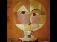
Attached is a famous representational painting by Paul Klee that has haunted me for decades.

'What does it really mean?' you may ask.

Someone asked the poet Robert Frost what a certain one of his poems meant. (I think it was Stopping by Woods on a Snowy Evening.) His seemingly curt response was, 'It means exactly what it says.'
 

Attachments

  • klee1.jpg
    klee1.jpg
    129.8 KB · Views: 89

Kingdubrock

Am I missing something? (ETA. This is in response to some earlier posts. While I was composing it, there appeared a few intervening posts.)

The issue doesn't seem to have anything to do with whether a piece of art is detailed or simple, representational or abstract, realistic or impressionist. It is more like whether the image actually conveys something relevant and interesting instead of just an original impression of something like the Jolly Green Giant.

Attached is a famous representational painting by Paul Klee that has haunted me for decades.

'What does it really mean?' you may ask.

Someone asked the poet Robert Frost what a certain one of his poems meant. (I think it was Stopping by Woods on a Snowy Evening.) His seemingly curt response was, 'It means exactly what it says.'

I'm not sure if you are missing something or not. To whom is your post addressed?