Flonz Victorian Lenormand

daphne

I kind of like them all and am wondering if it would be too distracting to use different ones on different cards.

I also like most of them, but it will be too messy to use all of them with no order. Distracting and confusing. I proposed a system that can let us enjoy their richness and also helps visually.
 

flying black kat

baylys:

I like both #2 - Sepia, and # 4 - Sanguine. Having done boating up in the Great Lakes I appreciate the North Star Compass Rose.

Glad that it can be made at a afforable price. I really am enjoying this thread. I was once going to make a inlaid tiled stair case landing out of the Compass Rose pattern.

Nice choice. I would like to suggest that instead of using the inks and stamps on the sides, trying to use them as if you were putting on the card correctly. I found this helped me to really see the total effect of the completed design.

Lovely and well thought out.
Kathy
 

baylys

baylys: I would like to suggest that instead of using the inks and stamps on the sides, trying to use them as if you were putting on the card correctly. I found this helped me to really see the total effect of the completed design.

Good idea! I need to do that. I was just experimenting last night, but really do need to do a proper sample card in each colour, and also test out the red vs black idea suggested by Daphne.

I want to get a new, much finer stamping pad today so the images come out crisper instead of a bit blurred. I have two colour choices, black onyx or charcoal grey. I'll test them in the shop and see which one suits best.
 

baylys

Ok, after testing out each colour on a card I have pics

Black writing
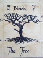
ImageUploadedByTapatalk1362105184.943770.jpg
Verdict: black with black looks too harsh and too monochrome

Sepia writing
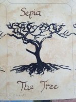
ImageUploadedByTapatalk1362105230.831860.jpg
Verdict: I still like, but I think the shade is too close to black

Tobacco writing
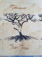
ImageUploadedByTapatalk1362105285.000711.jpg
Verdict: this looked too light before, but now it looks really good. This would be my pick

Raw Sienna writing
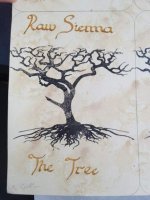
ImageUploadedByTapatalk1362105348.972981.jpg
Verdict: looks too yellow and pale

Sanguine writing
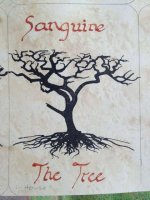
ImageUploadedByTapatalk1362105390.967153.jpg
Verdict: this was what I first used, simply because I had no other colour. I think it looks more red than brown and I think it is too bright. But it's still a funky colour.

I think it is between Sepia and Tobacco, with Tobacco winning by a nose.
 

tarot heart

I am torn between the sanguine and the tobacco. I actually prefer the sanguine. It really appeals!

ETA: I looked at them all several times more and yup, my vote is for the sanguine. :)
 

MoonGypsy

i am partial to the Tobacco...:D i do like the Sanguine, too...but i think i like the Tobacco just a wee bit more...

ETA: Sheesh, it is a toss up, really! i just looked again and i DO really like the Sanguine...Oy...:laugh: Both are appealing...:heart:
 

flying black kat

I can't decide. I am going to have to come back.

Kathy
 

papercutbliss

Wow, loving the sepia ones. I like the sophisticated simplicity of your deck :).
 

baylys

And I've just finished freehand line drawing the book. And I even copied in an Aesop fable :D

ImageUploadedByTapatalk1362110102.906367.jpg

Sorry the writing doesn't really follow the flow direction of the page. Can't be bothered changing it. It will be tiny and unreadable anyway.
 

ladybird

And I've just finished freehand line drawing the book. And I even copied in an Aesop fable :D


Your penmanship is beautiful, baylys!

My favorites are Tobacco and Sanguine too. Sanguine stands out a bit more while the Tobacco has a much softer feel. Funny how the Sanguine looks more red but only compared to the other brown tones. But by itself with the black tree it looks just brown. I think it will be marvelous whatever choice you make. :)

ETA: The Tobacco is lovely though.