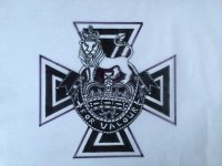
Flonz Victorian Lenormand

baylys

The cross

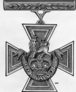
Ok, I have to admit, I am CRAZY PROUD of this image. It took me over 2 hours, freehand drawing from an image in my phone.

Here are the two pics I was using
ImageUploadedByTapatalk1362121481.174495.jpg
ImageUploadedByTapatalk1362121497.031435.jpg

And this is what I got
ImageUploadedByTapatalk1362121518.428188.jpg

This is the Victoria Cross, instigated by Queen Victoria as recognition for valour during the Crimean war. It is the highest medal of honour for armed forces personnel.

I am not religious and I do not like religious imagery, however this image still carries with it the basic meanings behind a standard cross (well, I believe so anyway :)).
 

Laura Borealis

:bugeyed: That looks so professional! Freehand? For real? You have a right to be proud!
 

Alta

That is a good idea for a Cross. I worked at the Canadian War Museum a while back, and read so many of the stories behind those crosses. A lot of them awarded posthumously, so there is the 'full stop' aspect of this card. Also the burden and love of duty.
 

wooden-eye

Baylys- crikey, look at you go. A duck to water. This cross drawing is really good. You said you were not artistic ( pause to look closely with suspicious eyes), well you are, so there.
The art is flowing really well. Would you consider having a bash at drawing the earlier cards freehand and moving away from the stamps? I really think you could do it with no problems. Just a thought, then it would be the Baylys Victorian Lenormond
By the way, I don't know that much about Lenormond, but all this talk is putting them up the list of more things to learn about. Sorry to be an ignoramus. This lack of knowing what the heck it is all about, made me slow to post on your thread, but now you are drawing- and that I get!
I love what you are doing though, pen and ink looks classic and classy.
Great updates and don't you dare finish before me!
Keep fanning the flames of that creativity- you will never look back.
Wooden-eye
 

MoonGypsy

i am totally gobsmacked!
Baylys, don't you dare ever say you can't draw again! :bugeyed: :D
That cross looks so professional, i am totally amazed...
You NEED to be told that you ARE an artist...Wow!

Oh yes, in case you were wondering, i love that image for "the Cross"...:p :D
 

baylys

But.....but.....all I was doing was copying pictures that already exist!

Until I did that lion I didn't know I could draw either :D
 

MoonGypsy

But.....but.....all I was doing was copying pictures that already exist!

Until I did that lion I didn't know I could draw either :D

Well, now you know! :p :D Don't stop...Feed your Muse...
 

Chronata

Well done! That cross is beautiful!
 

daphne

Ok, after testing out each colour on a card I have pics

Black writing
View attachment 62394
Verdict: black with black looks too harsh and too monochrome

Sepia writing
View attachment 62395
Verdict: I still like, but I think the shade is too close to black

Tobacco writing
View attachment 62396
Verdict: this looked too light before, but now it looks really good. This would be my pick

Raw Sienna writing
View attachment 62397
Verdict: looks too yellow and pale

Sanguine writing
View attachment 62398
Verdict: this was what I first used, simply because I had no other colour. I think it looks more red than brown and I think it is too bright. But it's still a funky colour.

I think it is between Sepia and Tobacco, with Tobacco winning by a nose.

Yup, tabacco for writing and numbering looks very good.
Keep sanguine and black for playing card inserts ;)
 

daphne

And I've just finished freehand line drawing the book. And I even copied in an Aesop fable :D

View attachment 62400

Sorry the writing doesn't really follow the flow direction of the page. Can't be bothered changing it. It will be tiny and unreadable anyway.

Lovely book!!! I like it more than stamps! You can draw your entire Lenormand! Are ARE talented.